
气泡
在 1.1.0 版本加入.
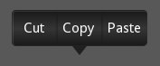
Bubble 控件是一种菜单形式或带有箭头的弹出小部件,箭头位于其内容的一侧。
:类`Bubble`包含一个箭头,附着在内容(例如,类`BubbleContent`)上,指向你选择的方向。它可以放置在预定义的位置,或者通过指定在控件边框上的相对位置来灵活放置。
:类`BubbleContent`是一个样式化的`BoxLayout`,设计用于作为子控件添加到类`Bubble`中。随后,类`Bubble`会根据需要围绕内容排列一个箭头。理论上,除了类`BubbleContent`之外,您也可以使用任何其他类`Widget`,只要它支持类`EventDispatcher`的'bind'和'unbind'功能,并且与Kivy兼容,能够放置在类`BoxLayout`内部即可。
BubbleButton 是一个样式化的按钮。它适合 Bubble 和 BubbleContent 的风格。您可以随意在 Bubble 的“内容”中放置其他 Widget。
在 2.2.0 版本发生变更.
属性 background_image、background_color、border 和 border_auto_scale 已从 Bubble 中移除。这些属性仅被内容控件使用,而现在该控件改用自身的属性。箭头的颜色现在通过 arrow_color 来更改,而非 background_color。这些更改使得 Bubble 透明化,可与其他布局作为内容一起使用,而不会因属性继承产生任何副作用。
属性 flex_arrow_pos 已被添加,以允许对箭头位置进行进一步的自定义。
已添加属性 arrow_margin、arrow_margin_x、arrow_margin_y、content_size、content_width 和 content_height,以便根据 Bubble 的内容大小轻松调整其尺寸。
气泡内容
BubbleContent 是一个样式化的 BoxLayout,可用于添加如 BubbleButtons 作为菜单项。
在 2.2.0 版本发生变更.
在 BubbleContent 中添加了属性 background_image、background_color、border 和 border_auto_scale。BubbleContent 不再依赖这些属性存在于父类中。
- class kivy.uix.bubble.Bubble(**kwargs)[源代码]
基类:
BoxLayoutBubble 类。更多信息请参阅模块文档。
- add_widget(widget, *args, **kwargs)[源代码]
将一个新部件添加为此部件的子部件。
- 参数:
- widget:
Widget 要添加到我们子控件列表中的控件。
- index:整数,默认值为0
在列表中插入控件的位置索引。请注意,默认值0表示控件被插入到列表的开头,因此会绘制在其他同级控件之上。关于索引和控件层级结构的完整讨论,请参阅 控件编程指南。
在 1.0.5 版本加入.
- canvas:字符串,默认为 None
用于添加控件画布的Canvas。可以是'before'、'after'或None以使用默认画布。
在 1.9.0 版本加入.
- widget:
>>> from kivy.uix.button import Button
>>> from kivy.uix.slider import Slider
>>> root = Widget()
>>> root.add_widget(Button())
>>> slider = Slider()
>>> root.add_widget(slider)
- arrow_color
箭头颜色,格式为 (r, g, b, a)。要使用它,您必须先设置
arrow_image。在 2.2.0 版本加入.
arrow_color是一个ColorProperty,默认值为 [1, 1, 1, 1]。
- arrow_image
指向气泡的箭头图像。
arrow_image是一个StringProperty,默认值为 'atlas://data/images/defaulttheme/bubble_arrow'。
- arrow_margin
箭头组件在x和y方向上自动计算所占用的边距,单位为像素。
请检查
arrow_margin_x和arrow_margin_y的描述。在 2.2.0 版本加入.
arrow_margin是 (arrow_margin_x,arrow_margin_y) 属性的ReferenceListProperty。它是只读的。
- arrow_margin_x
箭头部件在x方向上自动计算的边距(以像素为单位)。
结合
content_width,此属性可用于确定 Bubble 的正确宽度,以精确包裹箭头和内容,只需将content_width与arrow_margin_x相加即可。在 2.2.0 版本加入.
arrow_margin_x是一个NumericProperty,表示由于箭头控件在 x 方向上增加的边距。其默认值为 0,且为只读属性。
- arrow_margin_y
箭头部件在y方向上自动计算的边距(以像素为单位)。
结合
content_height,此属性可用于确定 Bubble 的正确高度,以通过将content_height和arrow_margin_y相加来精确包围箭头和内容。在 2.2.0 版本加入.
arrow_margin_y是一个NumericProperty,表示由于箭头部件在 y 方向上增加的边距。其默认值为 0,且为只读属性。
- arrow_pos
指定箭头相对于气泡的预定义位置。可以是以下值之一:left_top, left_mid, left_bottom top_left, top_mid, top_right right_top, right_mid, right_bottom bottom_left, bottom_mid, bottom_right。
arrow_pos是一个OptionProperty,默认值为 'bottom_mid'。
- content
这是气泡主要内容所在的对象。
通过`add_widget`设置的内容,以及通过`remove_widget`移除的内容,与放置在`ActionBar`中的:class:`ActionView`类似。
content是一个ObjectProperty,默认值为 None。
- content_height
内容Widget的高度。
在 2.2.0 版本加入.
content_height是一个NumericProperty,当 content 不为 None 时,它与 self.content.height 相同;否则,它默认为 0。该属性是只读的。
- content_size
内容Widget的大小。
在 2.2.0 版本加入.
content_size是 (content_width,content_height) 属性的ReferenceListProperty。它是只读的。
- content_width
内容Widget的宽度。
在 2.2.0 版本加入.
content_width是一个NumericProperty,当 content 不为 None 时,它与 self.content.width 相同,否则默认为 0。该属性为只读。
- flex_arrow_pos
指定箭头在
Bubble控件边框周围的弹性坐标位置。如果此属性设置为合适的位置(即Bubble控件内的相对像素坐标),它将覆盖arrow_pos的设置。在 2.2.0 版本加入.
flex_arrow_pos是一个ListProperty,默认值为 None。
- limit_to
指定气泡位置所限制的控件。
在 1.6.0 版本加入.
limit_to是一个ObjectProperty,默认值为 'None'。
- remove_widget(widget, *args, **kwargs)[源代码]
从该Widget的子级中移除一个Widget。
- 参数:
- widget:
Widget 要从我们的子控件列表中移除的控件。
- widget:
>>> from kivy.uix.button import Button
>>> root = Widget()
>>> button = Button()
>>> root.add_widget(button)
>>> root.remove_widget(button)
- show_arrow
指示是否显示箭头。
在 1.8.0 版本加入.
show_arrow是一个BooleanProperty,默认值为 True。
- class kivy.uix.bubble.BubbleButton(**kwargs)[源代码]
基类:
Button用于BubbleContent组件中的按钮。你可以使用“普通”按钮类,但除非更改背景,否则外观不佳。
请直接使用已经定义好的 BubbleButton 控件,它已经为你提供了合适的背景。
- class kivy.uix.bubble.BubbleContent(**kwargs)[源代码]
基类:
BoxLayout一个样式化的BoxLayout,可用作Bubble的内容组件。
在 2.2.0 版本发生变更.
:图形外观的
BubbleContent现在基于其自身的属性background_image、background_color、border和border_auto_scale。父级部件的属性不再被考虑。这使得 BubbleContent 成为一个独立的主题化 BoxLayout。- background_color
背景颜色,格式为 (r, g, b, a)。要使用它,您必须先设置
background_image。在 2.2.0 版本加入.
background_color是一个ColorProperty,默认值为 [1, 1, 1, 1]。
- background_image
气泡的背景图像。
在 2.2.0 版本加入.
background_image是一个StringProperty,默认值为 'atlas://data/images/defaulttheme/bubble'。
- border
用于
BorderImage图形指令的边框。与background_image一起使用。当使用自定义背景时应使用此属性。它必须是一个包含4个值的列表:(bottom, right, top, left)。关于如何使用它的更多信息,请阅读BorderImage指令。
在 2.2.0 版本加入.
border是一个ListProperty,默认值为 (16, 16, 16, 16)。
- border_auto_scale
指定背景BorderImage上的:attr:`kivy.graphics.BorderImage.auto_scale`值。
在 2.2.0 版本加入.
border_auto_scale是一个OptionProperty,默认值为 'both_lower'。